P
Print — Eurostile
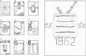
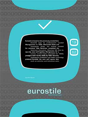
The typographic poster, Eurostile, is a display font released in 1962. This came from an era with a fascination with technology. I kept those qualities in mind and played around with geometric shapes.
Eurostile font style is a geometric sans-serif typeface. The shape of a television inspired the letter "o". The history information is shown as interlaced scanned lines and read every other line, the same way images are displayed on a television.
This poster won second place in the Typographic Poster division at the 2010 Annual Spring Show, Academy of Art University.
P
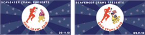
Print — Scavenger Crawl
-
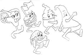
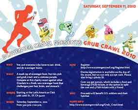
When I watched movies at a drive-in theater, there were advertisements before the show. One of the commercials was a cartoon of dancing snacks to entice you to buy food at the concession stand. I thought this would be a fun and humorous way to entice people to participate in a grub crawl.
Since the grub crawl fundraiser is to benefit American Veterans, I drew food that was well-known in American cuisine.
-
I volunteered at a non-profit organization, Scavenger Crawl that raises funds for various local charities by hosting scavenger hunt events.
This poster is to promote a food crawl scavenger hunt, Grub Crawl, which benefits local veterans. The stars and stripes were added to make the poster patriotic. Scavenger Crawl’s logo, the running man, playfully runs after the food characters to portray a fun-filled event.
The scavenger hunters redeem food from participating restaurants by purchasing vouchers shown below:
P
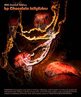
Print — bP Chocolate
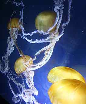
This photo was originally taken when I visited San Francisco’s Aquarium of the Bay.
-
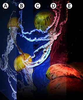
The original image looked flat with lack of contrast and shadow.AThe texture and the color saturation of the jellyfish were emphasized to make it seem radioactive by adjusting the brightness/contrast, exposure, and vibrance Photoshop tool.BThe chrome filter was added to create an oil slick in the water and used the same Photoshop image adjustments to increase the viscous texture.CThe hue of the water was changed to a brown-pink overlay to make a "chocolate water" color.DChanging the color lost some of the texture created earlier, so adjusted the levels, brightness/contrast, and hue/saturation of the image.E
The BP oil disaster in the Gulf of Mexico was catastrophic. This poster is my criticism of how the value of profit overrides the environment. The photography of jellyfishes were taken during my visit at a local aquarium. The jellyfishes were used to portray the oil-water slick since their translucent bodies reflect their surroundings.
P
Print — T Candy
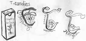
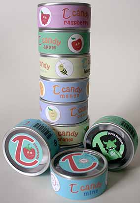
I first started out with detailed characters. The lines and shapes were later simplified due to the small packaging dimensions.
A friend of mine gave me some of her tea-infused candy. The packaging was plain with a monotone color palette. I thought it would be more interesting to "dress-up" this wrapper and make it colorful and appeal more to kids.